Elevate Your Home’s Exterior with These 3 Color Themes
September 13, 2024
When it comes to transforming your home's exterior, one of the most powerful tools at your disposal is… color! Color has a profound influence on a space and the people in it - it influences moods and can evoke a range of emotions. Therefore, the paint you choose not only enhances curb appeal but also sets the tone for how people feel when they pull into your driveway!
Are you ready to learn how selecting the right exterior paint colors can turn your home into a space that reflects your personality and the environment around you? Let’s dive in and explore three color palette themes - Light & Bright, Pacific Northwest-Inspired, and Dramatic & Moody - and how each can transform the look and feel of your home.
1. Light & Bright
For those who want their home to appear open and airy, light & bright exterior colors are a great choice! Think crisp whites, soft beiges, or subtle grays. These colors not only make a home feel fresh and approachable, but also reflect more natural light, which can make the property appear larger and more inviting.
Design Tip: Pair these colors with accents like natural wood, black trim, or vibrant front doors to add dimension and personality!

Swiss Coffee Cottage
Bright neutrals gave this home a stunning update. Swiss Coffee was selected for the siding in order to add brightness to the exterior. Revere Pewter and Amherst Gray were used to help accent window trim, sashes, and the front door for an understated, classic look.
Colors Used:
- Benjamin Moore Swiss Coffee OC-45
- Benjamin Moore Revere Pewter HC-172
- Benjamin Moore Amherst Gray HC-167
Gray Owl Tudor
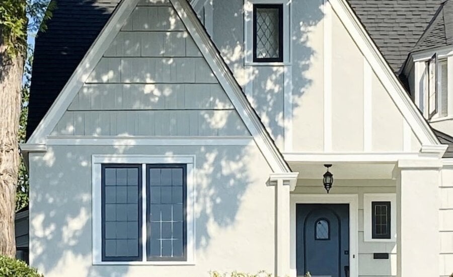
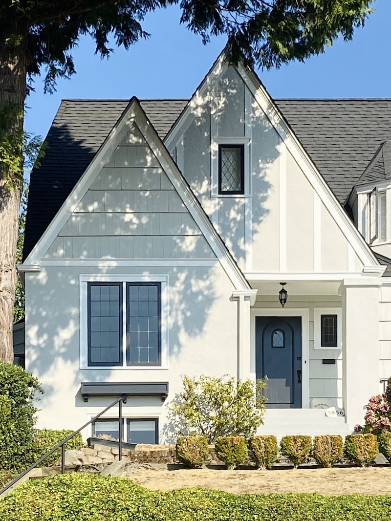
This beautiful Tudor home got a stunning makeover in Benjamin Moore’s Gray Owl and it couldn’t look more refreshed. As one of our favorite neutral ‘greige’ colors, this color is a spectacular choice for this home. We chose Simply White as the trim color so it would provide contrast to the neutral siding color. To add drama to this color scheme, we recommended Black Iron for the windows and front door. The combination of a neutral siding color, white trim and a dark window, give this Tudor home a timeless look.
Colors Used:

Semolina Craftsman
Benjamin Moore’s Semolina transformed this cute craftsman into a bright and sunny home! We love the impact that this golden hue has on this exterior. To balance this warm yellow, we used an off-white with subtle yellow undertones on the trim and columns. Next to Semolina, it looks bright and fresh. We rounded off the entire color scheme with a Burnt Sienna front door to complement the porch floor, which the clients wanted to keep. Alternatively, a medium-toned gray would have looked beautiful on the porch floor and front door.
Colors Used:
2. PNW-Inspired
Homes in the Pacific Northwest have a unique relationship with nature, often surrounded by lush greenery, misty mountains, or rugged coastlines. Inspired by this landscape, a color palette that includes deep greens, muted blues, and earthy grays pairs well with the natural environment. These colors can help make a home feel grounded, stable, and serene.
Design Tip: Consider pairing these natural hues with stone or cedar accents, or matte black fixtures to introduce a contemporary feel. This palette is perfect for homes in wooded or coastal areas, where muted tones can blend beautifully with the natural landscape.
Sioux Falls Craftsman Remodel
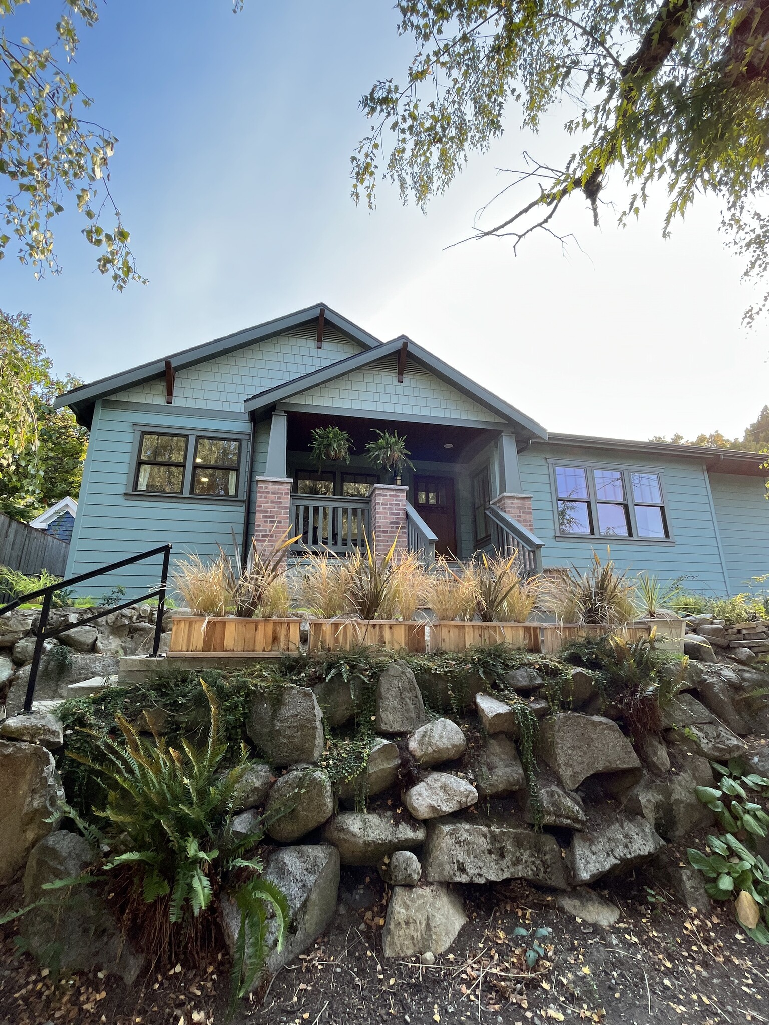
This newly remodeled craftsman flawlessly demonstrates a reimagined historical color palette while leaning into our Pacific Northwest roots. Sioux Falls and Raindance revitalize this newly remodeled craftsman home in the most PNW way, using our favorite blue-greens to create a stunning monochromatic study in the different siding styles! We are particularly captivated by the use of a non-white trim and the flair Millstone Gray gives the home!
Colors Used:
Graystone Victorian
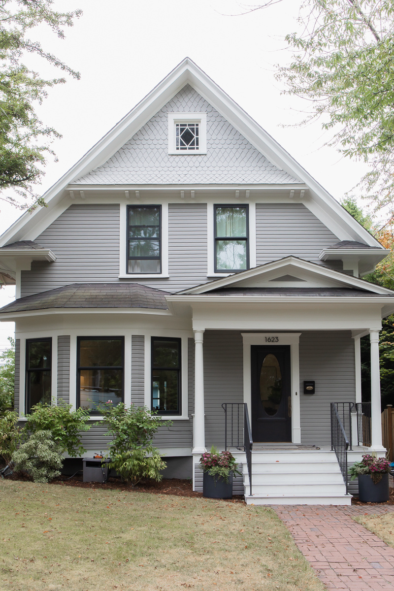
This beautiful Victorian home shines in Benjamin Moore’s Graystone. This classic gray is both inviting and timeless. The upper shakes, painted in Cape May Cobblestone, bring another layer of elegance to the entire home. Graystone and Cape May Cobblestone are the perfect marriage of sophistication and simplicity. White Dove trim is accompanied by a Jet Black front door to give this charming Victorian residence the perfect balance of timelessness and modernity.
Colors Used:
- Benjamin Moore Graystone 1475
- Benjamin Moore Cape May Cobblestone 1474
- Benjamin Moore White Dove OC 17
- Benjamin Moore Jet Black 2120 – 10

Cheerful Wallingford Craftsman
Striking that balance between charismatic and practical, this cheerful craftsman home in Wallingford wrote the book on modern PNW palettes. Our clients wanted to completely refresh their home with a brighter, less visually-heavy color palette while still remaining unique and beautiful. Enter Benjamin Moore's Intrigue. Inspired by a home a few neighborhoods over, we created this beautiful tri-color palette to give their home a soft but dynamic feel.
Colors Used:
3. Dramatic & Moody
For those who prefer a more dramatic and modern look, dark & moody exterior colors like charcoal, deep navy, or black can be an exciting choice! These colors offer a sophisticated and contemporary aesthetic that can make you feel empowered every time you see your home.
Design Tip: Dark exteriors pair well with contrasting elements like off white trim and natural wood accents to avoid feeling too heavy or overwhelming.
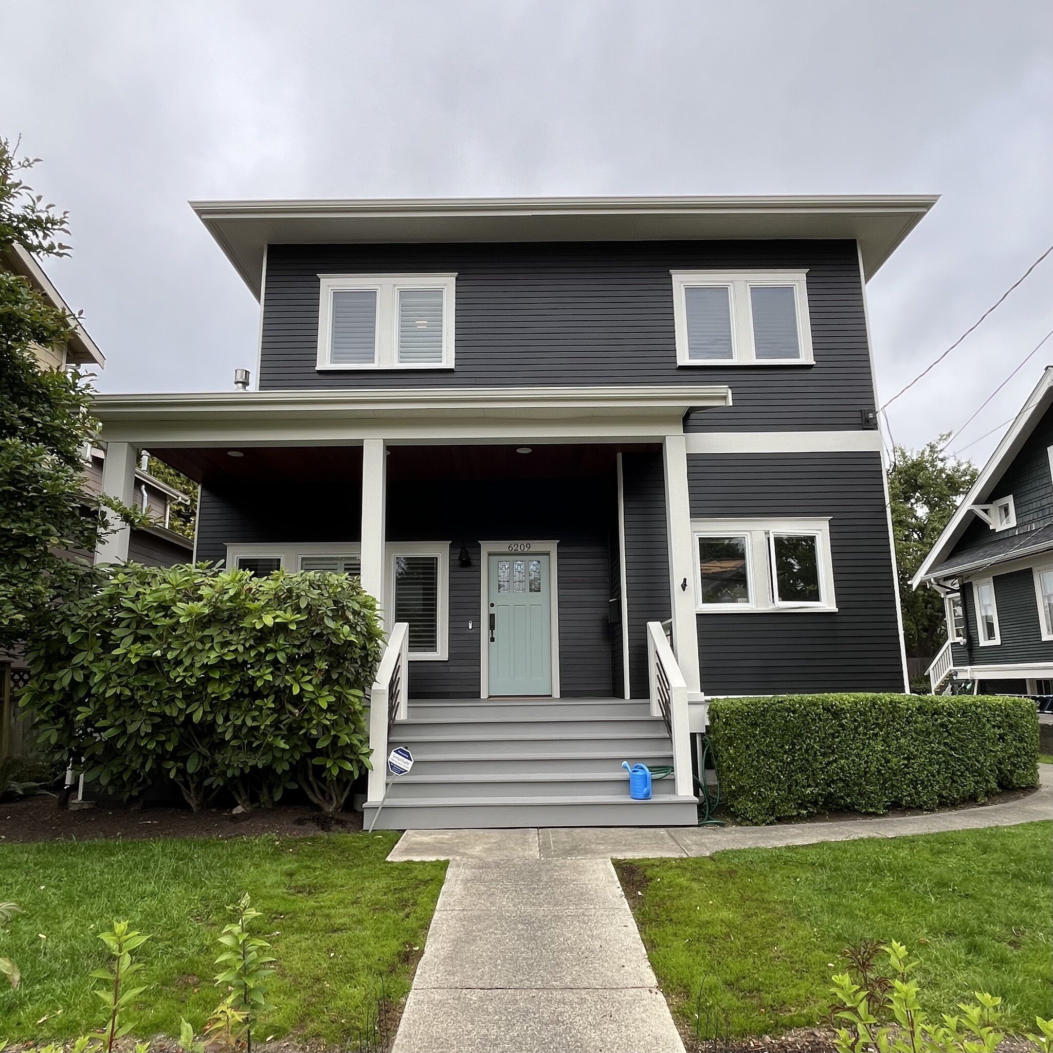
Jet Black Beauty
Dark doesn’t have to mean dreary - go bold or go home! This gorgeous Greenwood home is proof that deep colors can still feel fresh and full of life! For this modern home, we opted for Jet Black from Benjamin Moore to give the siding some beautiful depth. To avoid unwanted starkness, we opted for Grandma's China for the trim color, softening the look with its light and warm gray tones. Pulling out the slight blue undertones in Jet Black is Sylvan Mist for the front door color. We love how this palette emulates a moodier version of the classic Cape Cod look!
Colors Used:
- Benjamin Moore Jet Black 2120-10
- Benjamin Moore Grandma's China CSP-365
- Benjamin Moore Sylvan Mist CSP-740
- Benjamin Moore Graystone 1475

Blue Spruce Craftsman Home
This craftsman home is a bold statement in this saturated blue-gray hue. It is the perfect color to both stand out while complementing the greenery surrounding the home. For trim, we went with an off white with beige undertones to keep it soft while adding contrast.
Colors Used:
When choosing an exterior paint color, consider how you want to feel when you come home at the end of the day, and how you want your home to resonate with its surroundings. Whether you’re looking for a light & bright look to lift your spirits, a PNW-inspired palette that blends with nature, or a dramatic hue that makes a bold statement, the right exterior paint colors can set the perfect tone for your home.
Ready to discover the perfect palette for your Seattle home? Click here to schedule your interior or exterior paint color consultation today!